For this client case we made sales performance predictable with real-time insight into the KPIs. The dashboard is a demo, based on a dashboard of one of our clients, a software developer.
The existing management reports of the client came from Exact Online and Excel. Although the company was growing, the insight into the operating results remained limited and static. With Excel it is quite a job to report on how many of which products were sold, when and to which client.
Check out the Live Power BI Dashboard
Overview KPI dashboard
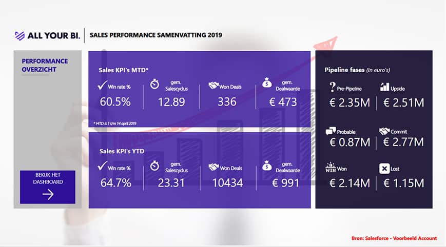
The KPI Dashboard contains the overview of the most important sales KPIs. It ensures the MT can always manage on current figures from Power BI.
The KPI Dashboard shows how the current month relates to the current year and which deals are where in the pipeline and the current phase of the deals.
Regional Sales dashboard
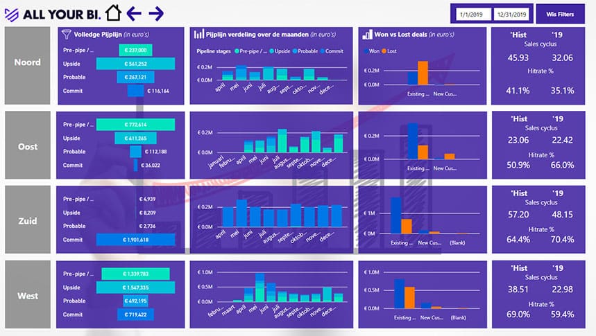
This Power Bi report provides sales information by region. This report would help answering the following questions
- How much value is in the pipeline and in which phase are the deals?
- How is the pipeline value divided over the months?
- When are the deals expected to be closed (won/lost)?
- How many deals (in %) have we won or lost?
- What is the historical perspective on the sales cycle?
- What is the historical perspective on the hit rate?
Sales Detail dashboard
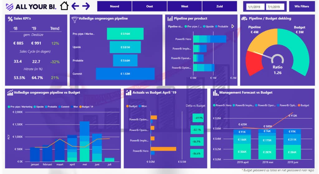
At every MT meeting or weekly with the sales team it is possible to ask and answer questions, such as:
- If the sales cycle is shorter, is that because the average deal size is smaller?
- Which products constitute the pipeline?
- How does the value of the pipeline compare to the budget?
- What should the relationship be on the basis of the hit rate?
- How do the actuals compare to the budget? Am I ahead or behind? On which products?
- Which products constitute my actuals (won)?
- How does the forecast look compared to the Budget? Is this realistic versus my pipeline cover in combination with my hit rate and sales cycle?
Actuals vs Budget Dashboard
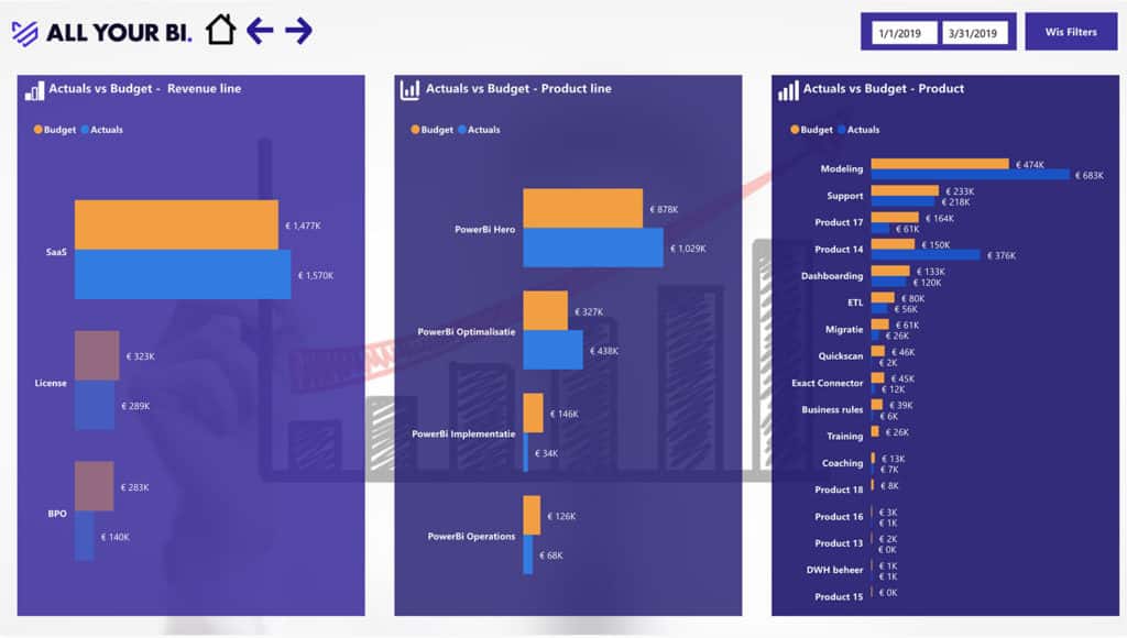
With this Power BI dashboard you can see how the various products and turnover flows relate to the budget. With the different visualisations the situation is clear in one overview and it shows what still requires extra attention.
Employee Performance Dashboard
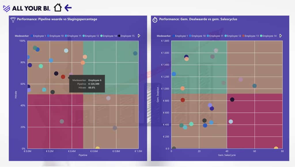
The left graph shows the relationship between the hit rate per employee and the pipeline value of the employee. Employees with a high hit rate and a high pipeline are expected to convert a large part of their pipeline into deals won. Employees with a low pipeline are expected to stir up their network in order to fill the pipeline with prospects. By putting the mouse on a specific employee, as in the left graph, the details show up immediately.
The right graph shows the comparison between the average sales cycle and the average deal size. In the ideal situation, an employee does major deals in the shortest possible time. Does the employee sell small deals with a short lead time or large deals with a longer lead time?